Deans' Dashboard Guide
Full PDF version of the guide, which includes detailed screen captures.
WSU Deans' Dashboard, Helpful Tips for Data Users
 Filters
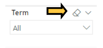
To choose multiple options, hold down "CTRL" and make your selection. Quickly clear selections by clicking the eraser icon that appears in the upper-right-hand corner when hovering over the filter. Most visuals adjust to the main filters located at the top or side of the page.
Cross-filter
When applicable, most reports have filters that sync across pages. For example, if Fall 2020 is selected in the Term filter, it will automatically adjust the data on all other pages of that report to Fall 2020 term.
Focus Mode
To isolate a visual, hover over it and click on the window icon, which appears in the upper-right-hand corner of the visual.
 Data Download
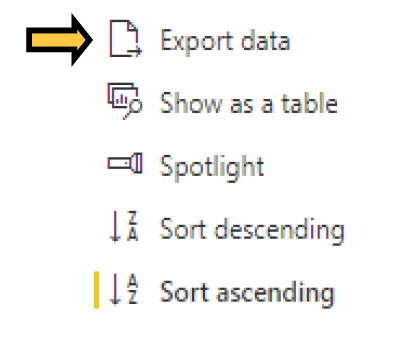
Hover over a visual and click on the "..." in the upper-right-hand corner of the visual. Select "export data" to obtain summarized data in Excel or CSV format. Note, this feature is only available on Decision Support dashboards.
Report Navigation
Use available bookmarks embedded within reports or tabs at bottom to move between pages. Bookmarks are generally located at the top of a dashboard and can appear in button or arrow format.
Tabs are always located at the bottom of dashboards.
![]()
Sort
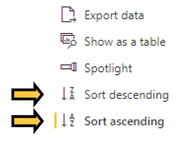
Adjust data in visuals to ascending or descending order by hovering and clicking on the "..." in the upper-right-hand corner of the visual. Additionally, tables may be sorted by clicking on their headers.


Stepped Layout Within Chart Visuals
Some data charts have the ability to expand/collapse rows within the visual in order to view additional hierarchical data. If you see a +, you may click it to view additional rows of data nestled underneath the parent. Similarly, collapse the expanded rows by clicking on the - , which appears once the data has been expanded.

Drill down/up
Certain visuals have the ability to drill down and drill up data points in order to explore in-depth details. If you see drill controls, which appear as a series of four arrows ![]() , while hovering over a visual, this visual has a hierarchy.
, while hovering over a visual, this visual has a hierarchy.
Additional Features
Most reports include call-outs that appear when hovering over visuals & data-points.
